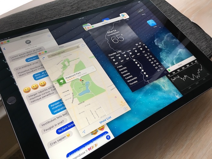
iPad windows
Advanced UI
On last week’s episode of the ATP podcast (it’s a great show) the hosts discussed a future iPad OS that would allow apps to run in a windowed UI much like on macOS (although not necessarily exactly like macOS). Many have said that the iPad represents the future of computing and aims to eventually replace many tasks that are currently done on the Mac. If this is so, it will need to offer more complex UI affordances like resizable and reposition-able apps in your own hand-tuned workspace.
As mentioned in the show, there have been some interesting efforts to test-drive an iPad UI like this. For example, Steve Troughton-Smith’s awesome Finder demos and the PanelKit UI framework for iOS.
Since I had a few iOS app prototypes already available with the release of Kite, I decided to try to meld them all into one ‘windowed iPad’ UI experiment. You can see a video demo below.
Demo
Kite Demo Document
The resulting .kite document is very large and likely contains too many layers to run at a high frame rate on most systems. Nonetheless, it’s a fun experiment to see what windowed apps on an iPad may feel like. As stated during the show, you have to just keep trying ideas until you find something that feels like the right direction. I doubt this macOS-esq window chrome will serve the needs for iOS – but something out there will.
If you’d like, you can open and run the .kite demo document right on your iPad (or iPhone, but it will be quite small!) with the Kite for iOS app. You can download the document for sized for:
- iPad Pro:
 iPadProWindowDemo.kite
 - iPad:
 iPadWindowDemo.kite
